Passo a Passo Para Escolher Uma Paleta de Cores
Quando se trata de decorar um ambiente, uma das coisas mais importantes a se considerar é a escolha das cores.
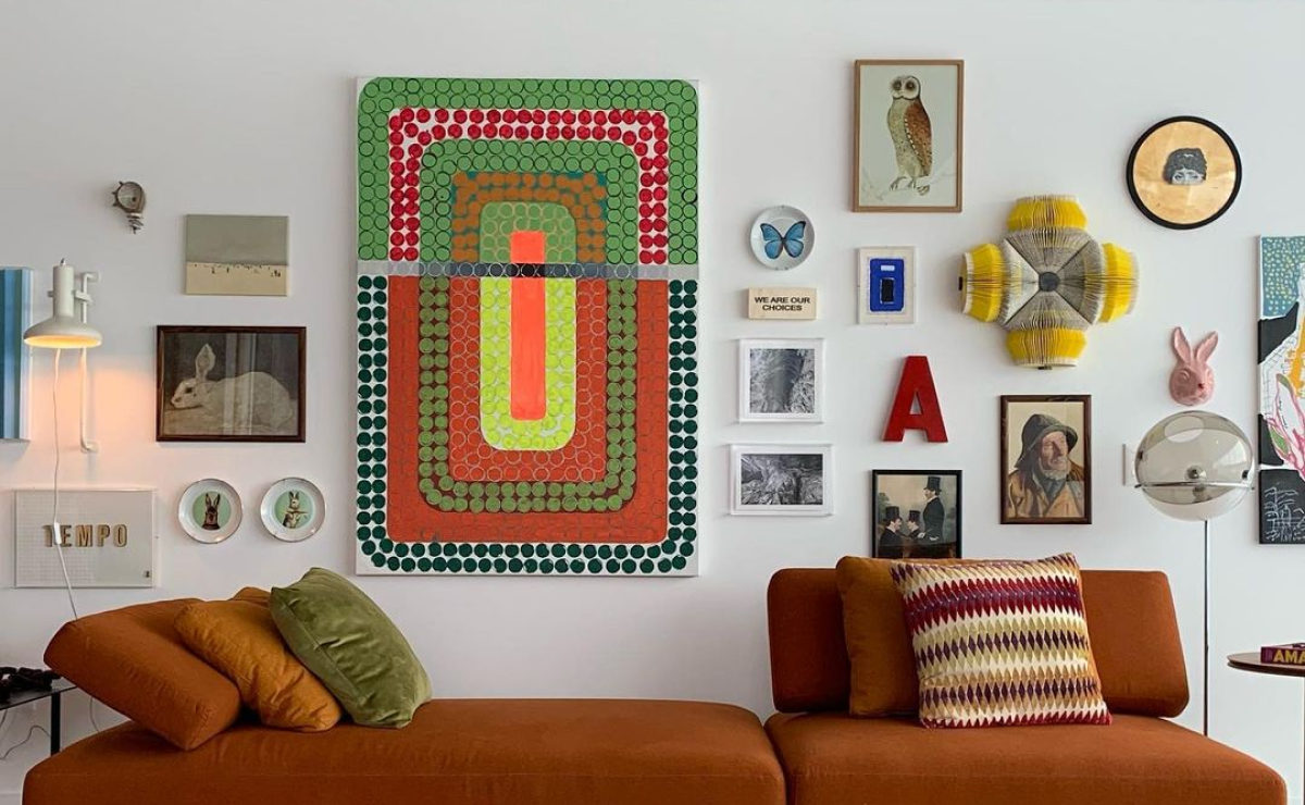
As cores têm o poder de transmitir sensações, criar atmosferas e influenciar diretamente no clima do ambiente.
Montar uma paleta de cores para o seu ambiente pode ser um desafio, mas com algumas dicas simples e um pouco de criatividade, é possível criar uma combinação harmoniosa e agradável aos olhos.
Neste artigo, vamos introduzir algumas técnicas e conceitos básicos sobre paletas de cores, que serão úteis na hora de montar a sua própria.
Veremos como identificar as cores dominantes, escolher as cores complementares e criar uma atmosfera equilibrada.
Então, continue lendo para descobrir como montar uma paleta de cores para o seu ambiente e transformá-lo em um espaço único e personalizado!
O que são as paletas de cores?
Uma paleta de cores é um conjunto de cores pré-selecionadas que são usadas em um projeto ou design.
É uma ferramenta fundamental para designers, artistas e profissionais criativos, pois oferece uma base para a escolha e combinação de cores harmoniosas em uma obra.
Uma paleta de cores pode ser constituída de diversas maneiras. Alguns exemplos comuns incluem:
1. Paleta monocromática: consiste em diferentes tons de uma única cor. É uma opção segura e sofisticada para criar harmonia e equilíbrio visual.
2. Paleta análoga: inclui cores posicionadas próximas no círculo cromático. São combinações agradáveis aos olhos e oferecem possibilidades de contraste.
3. Paleta complementar: envolve cores opostas ou contrastantes no círculo cromático. Essas combinações podem criar uma aparência ousada e vibrante.
4. Paleta de tons pastel: composta por cores suaves e com baixa saturação, proporcionando uma sensação delicada e harmoniosa.
5. Paleta de tons quentes ou frios: consiste em cores que evocam sensações de calor (tons quentes, como vermelho, laranja e amarelo) ou frio (tons frios, como azul, verde e roxo).
Essas paletas podem ser usadas para transmitir diferentes emoções e atmosferas.
A escolha da paleta de cores é crucial para a identidade visual de um projeto, produto ou marca. Ela pode influenciar o humor, a percepção e a experiência do público.
É importante considerar fatores como contexto, público-alvo, objetivo e significado cultural das cores ao criar uma paleta adequada.
Hoje em dia, existem muitas ferramentas online que auxiliam na criação de paletas de cores, permitindo aos profissionais salvar, compartilhar e utilizar essas combinações em seus projetos de forma rápida e eficiente.
Dicas para montar uma paleta de cores
Montar uma paleta de cores envolve selecionar e combinar as cores certas para criar um esquema visual atraente e harmonioso. Aqui estão algumas dicas para te ajudar nesse processo:
1. Considere a psicologia das cores:
Cada cor evoca diferentes emoções e sentimentos. Antes de escolher suas cores, pense no objetivo e na mensagem que você deseja transmitir.
Por exemplo, cores quentes como vermelho e laranja podem transmitir energia e paixão, enquanto cores frias como azul e verde transmitem tranquilidade e serenidade.
2. Escolha uma cor principal:
Comece selecionando uma cor principal que irá guiar sua paleta. Pode ser uma cor que já esteja associada à sua marca ou um tom que você goste.
Essa cor deve refletir a personalidade ou o tema que você deseja transmitir.
3. Use a Teoria das Cores:
A Teoria das Cores é uma ferramenta útil para combinar e harmonizar cores.
Por exemplo, você pode optar por uma paleta monocromática, usando diferentes tons da mesma cor, ou uma paleta complementar, combinando cores opostas no círculo cromático.
Você também pode explorar paletas análogas, que são cores próximas umas das outras no círculo cromático.
4. Considere o contraste:
O contraste entre as cores é importante para garantir que elementos importantes se destaquem.
Certifique-se de que as cores escolhidas possuam contraste suficiente para tornar o design claro e legível. Cores opostas no círculo cromático geralmente fornecem um bom contraste.
5. Teste a acessibilidade:
Ao selecionar suas cores, verifique se elas são acessíveis a todos os usuários, incluindo pessoas com deficiência visual.
Ferramentas online, como o simulador de daltonismo, podem ajudar a identificar cores que possam causar dificuldades de leitura.
6. Considere a simbologia cultural:
As cores podem ter significados diferentes em diferentes culturas. Se o seu design for direcionado a um público específico, certifique-se de entender as associações culturais das cores para evitar conotações indesejadas.
7. Leve em consideração a legibilidade:
Certifique-se de usar cores que garantam uma boa legibilidade do seu texto. Evite combinações de cores muito claras ou muito escuras que possam dificultar a leitura.
Acesse a categoria Casa do site Informe-se.com e veja as melhores dicas
Considerações finais
Lembre-se de que o equilíbrio e a consistência são essenciais ao montar uma paleta de cores.
Teste diferentes combinações e peça opiniões para garantir que sua paleta de cores transmita a mensagem desejada e crie um design atraente.